
TalkNow
eLearning, Skill-Building, and how to handle failure.
Challenge:
Our client wanted to take advantage of an industry that is projected to add 57 million new users by 2027. Leading a team of eight, I was tasked with designing a cutting-edge online learning platform that is feature-rich but intuitive, while emphasizing usability and accessibility.
My Role:
Conducting user research, prototyping, and visualization.
Outcome:
I learned a lot about conducting user research and how to handle inter-departmental conflicts. That’s the best I can say for this project (really, look at the final product).
In case you were wondering, I leave this project up because I believe it’s important to own your failures.
Surveys
We were able to conduct interviews with potential users with surveys and face-to-face interviews.
Interview subjects were divided into three categories:
• Instructors (8)
• Learners (25)
• Subscribers (10)
The questions for the learners and subscribers were divided into loose categories focusing on goals, experience, and motivations.
Examples of goal questions:
“What goals did you set when you registered for online lessons?”
“How did you set those goals?”
“Were you successful in those goals?”
“How did you meet those goals/what do you think you could have done differently?”
Examples of experience questions:
“What was your best experience with education?”
“Talk about a time when a learning experience did not live up to your expectations.
Examples of motivation questions:
“How do others experiences influence you when it comes to making decisions about your own learning?”
“Why are you considering digital learning as opposed to face-to-face, in-class learning?”
Results and Findings
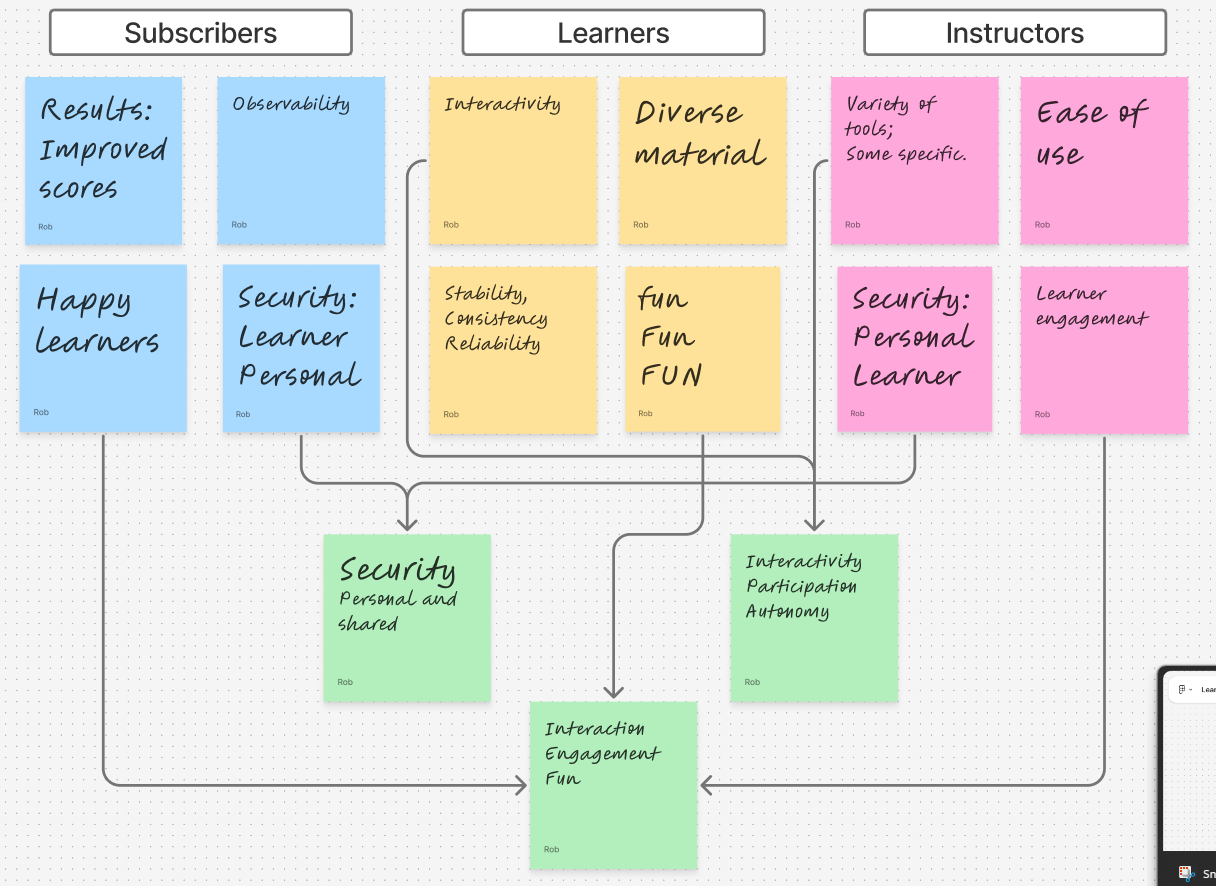
Our findings varied, but were not particularly surprising.
Learners wanted an enjoyable experience in which they could actively participate, while instructors wanted an easy to use platform with a variety of tools that would keep learners engaged. It was heartening to see so many instructors express concern for learners as much as themselves.
There was also a fair amount of overlap between groups.
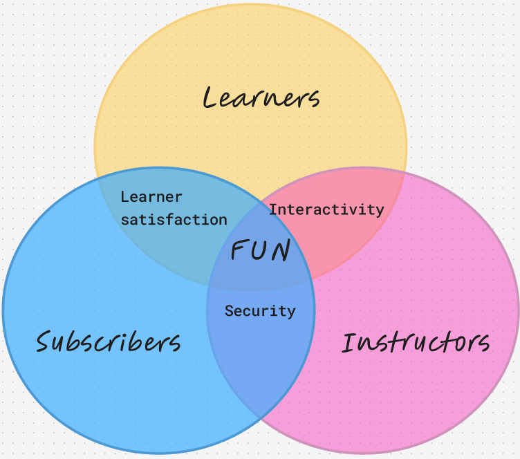
Long story short: “adult” groups put an emphasis on security and tangible results, while learners were more concerned with interactivity and enjoyment, though all three were concerned with the latter.
When drawing up our user profiles, we bear in mind that language learning can be broken into two skills categories:
Receptive Skills: Listening, Reading
Productive Skills: Speaking, Writing
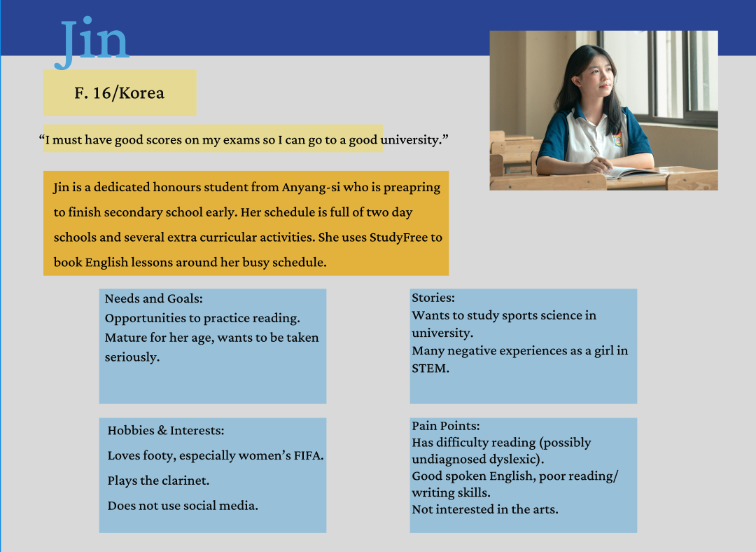
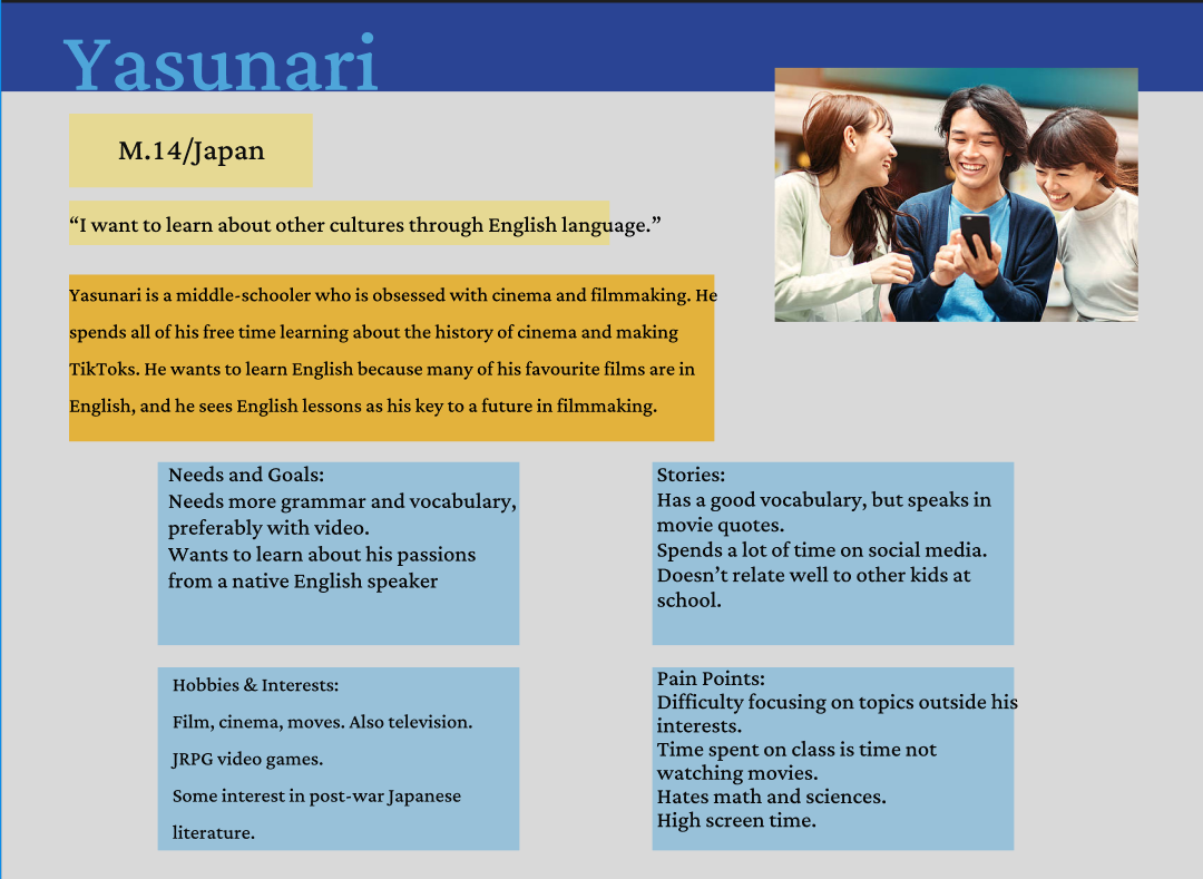
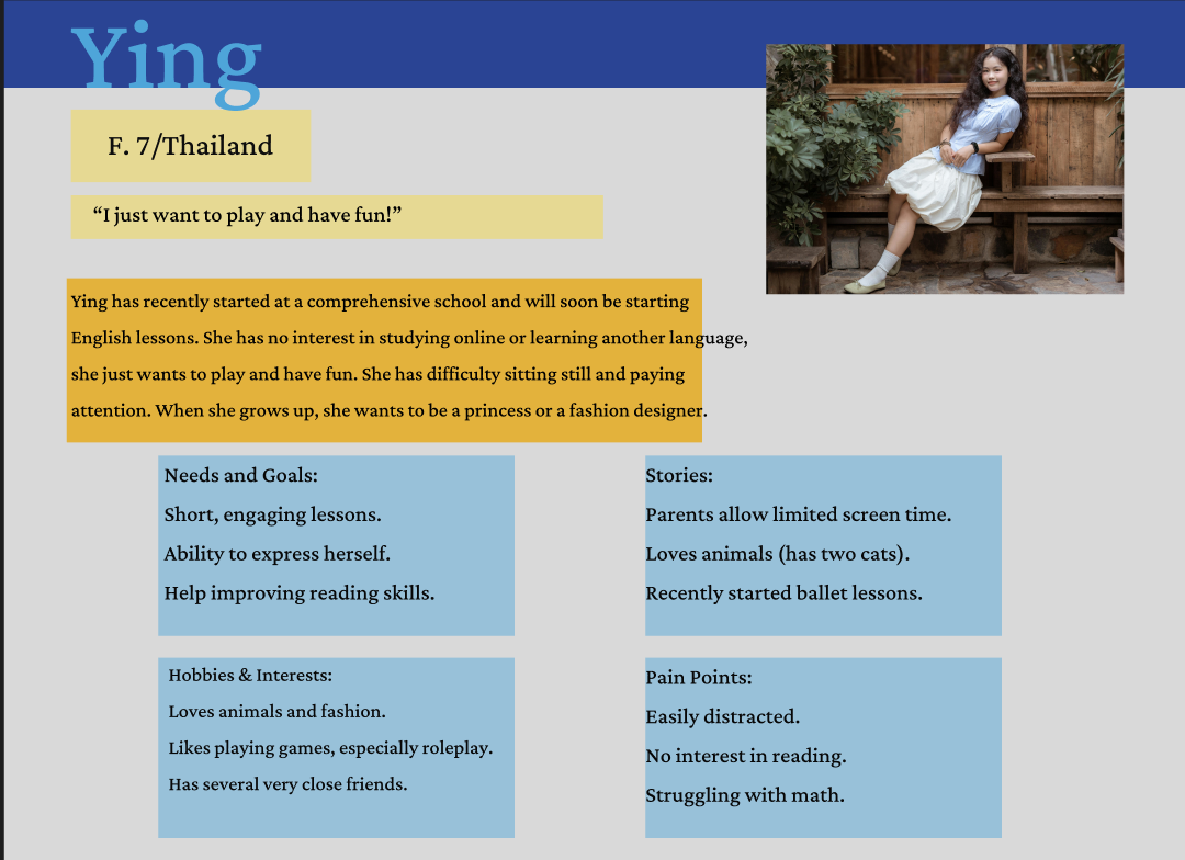
Bearing this in mind, our user profiles drew attention to some interesting challenges. Ying will want more fun, while the other three want more serious engagement. Yasunari will definitely need a means to share video, while Jin will benefit more from reading exercises.
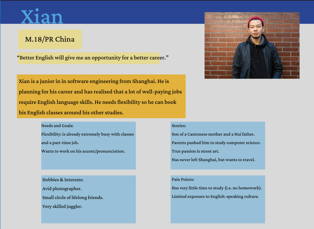
Xian seemed to represent a common thread with the others as a general learner. He had similar needs to the other three, in that he wanted to work on receptive and productive skills, as well as have a high level of engagement. We used him as a general point of reference for the rest of development; “How would Xian feel about/respond to/use that?”
Learner Profiles
Our client was based in East Asia and it was supposed that the vast majority of users would be as well. Therefore it was critical to include a diverse set of potential users.
Meet our learners!:
Prototyping
Prototyping was relatively straightforward. We were constrained by the functions of the platform and industry standards, so we opted to keep it simple and functional.
+
I did say ‘simple’, didn’t I?
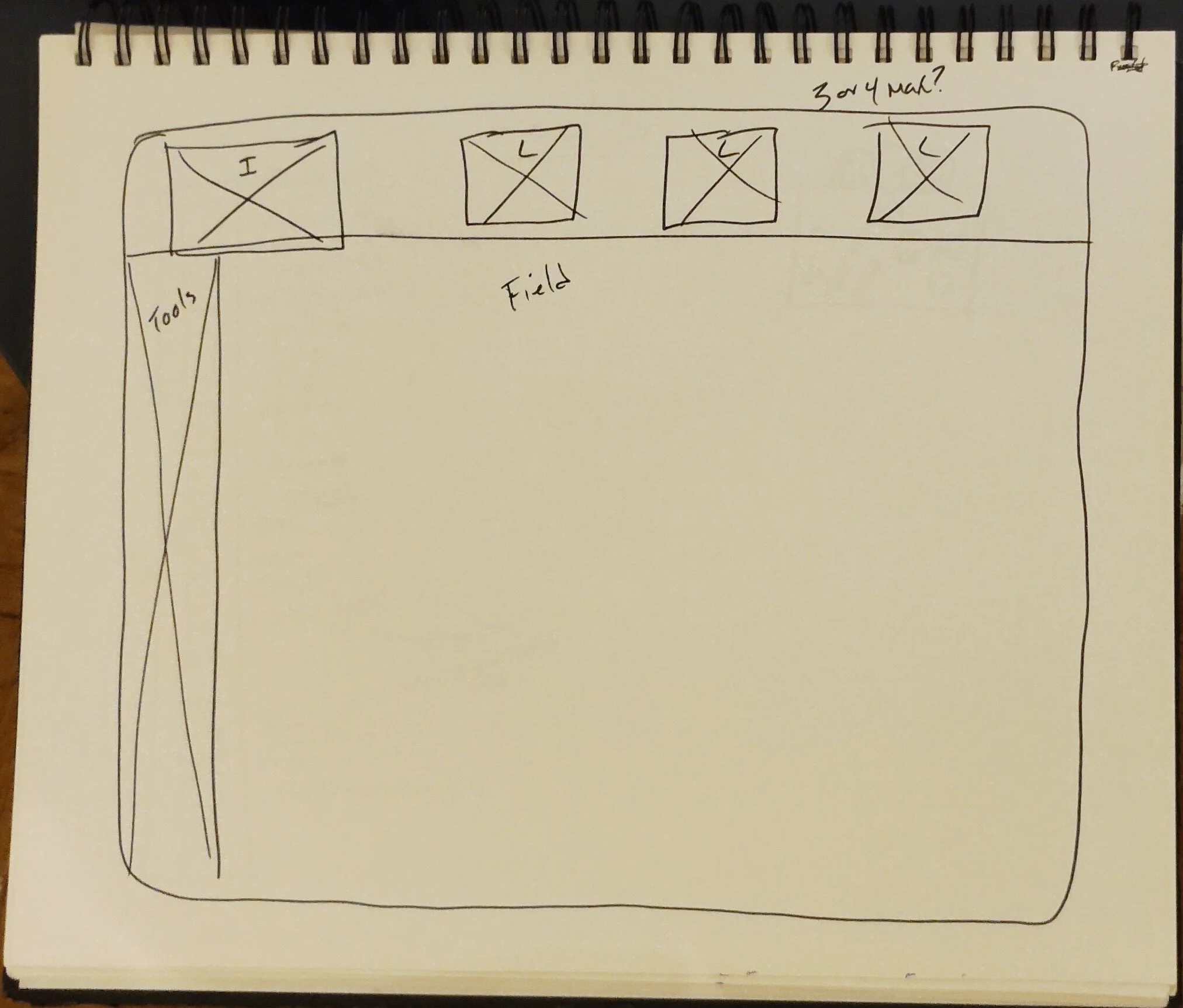
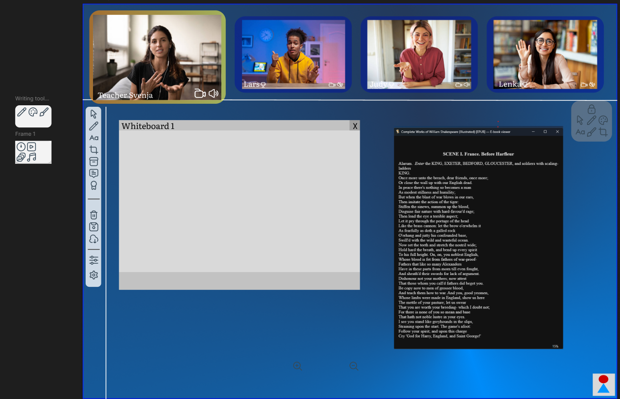
With the main interface, it was really just a question of what features we needed and wanted and where to put them.
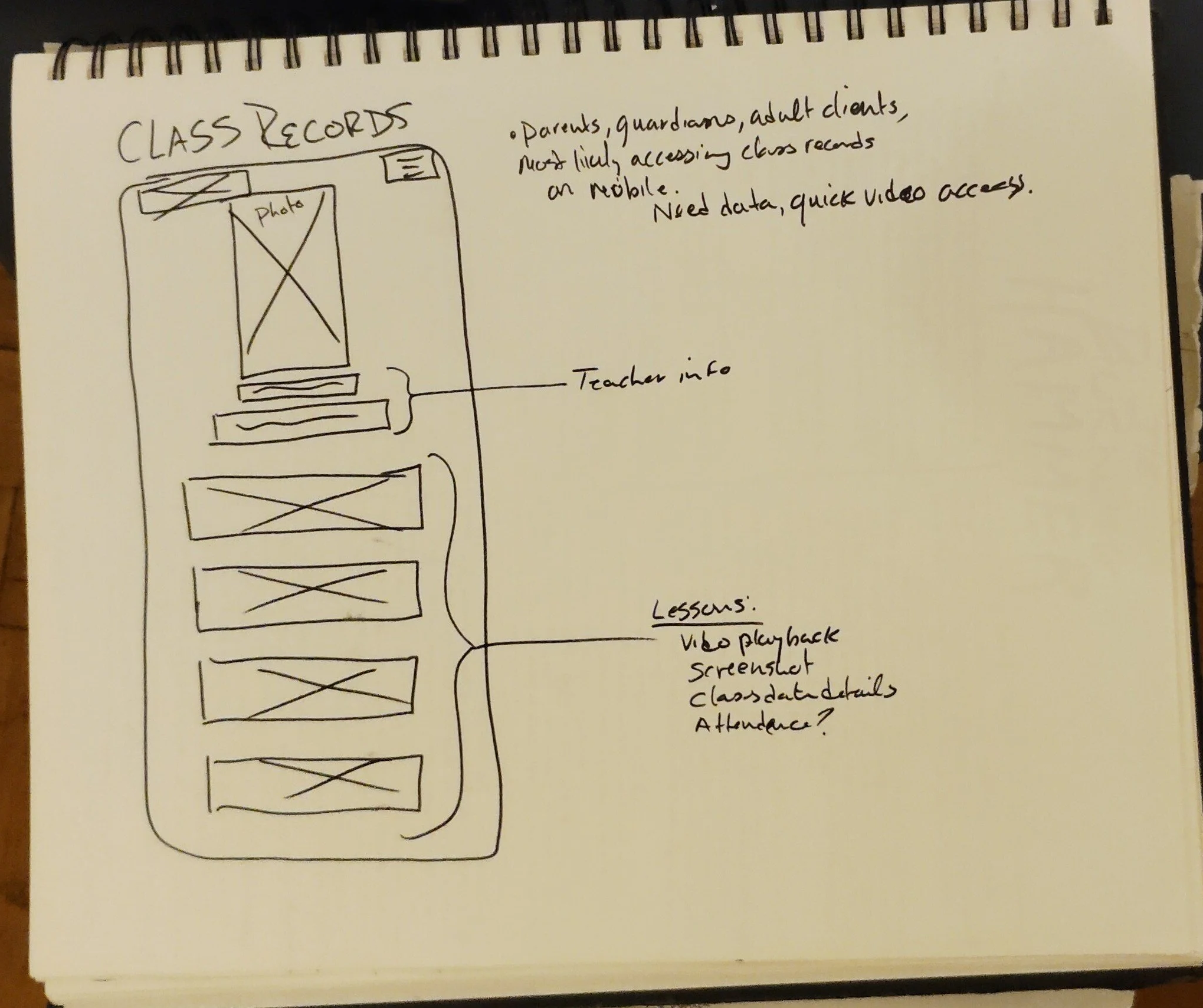
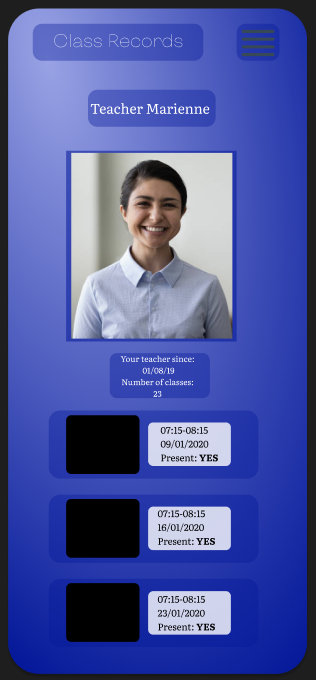
A key detail was where to put the learners’ screens. We wanted to maintain the feeling that the learner and instructor were making eye contact so lessons would feel more personal, so we put them at the top of the screen.
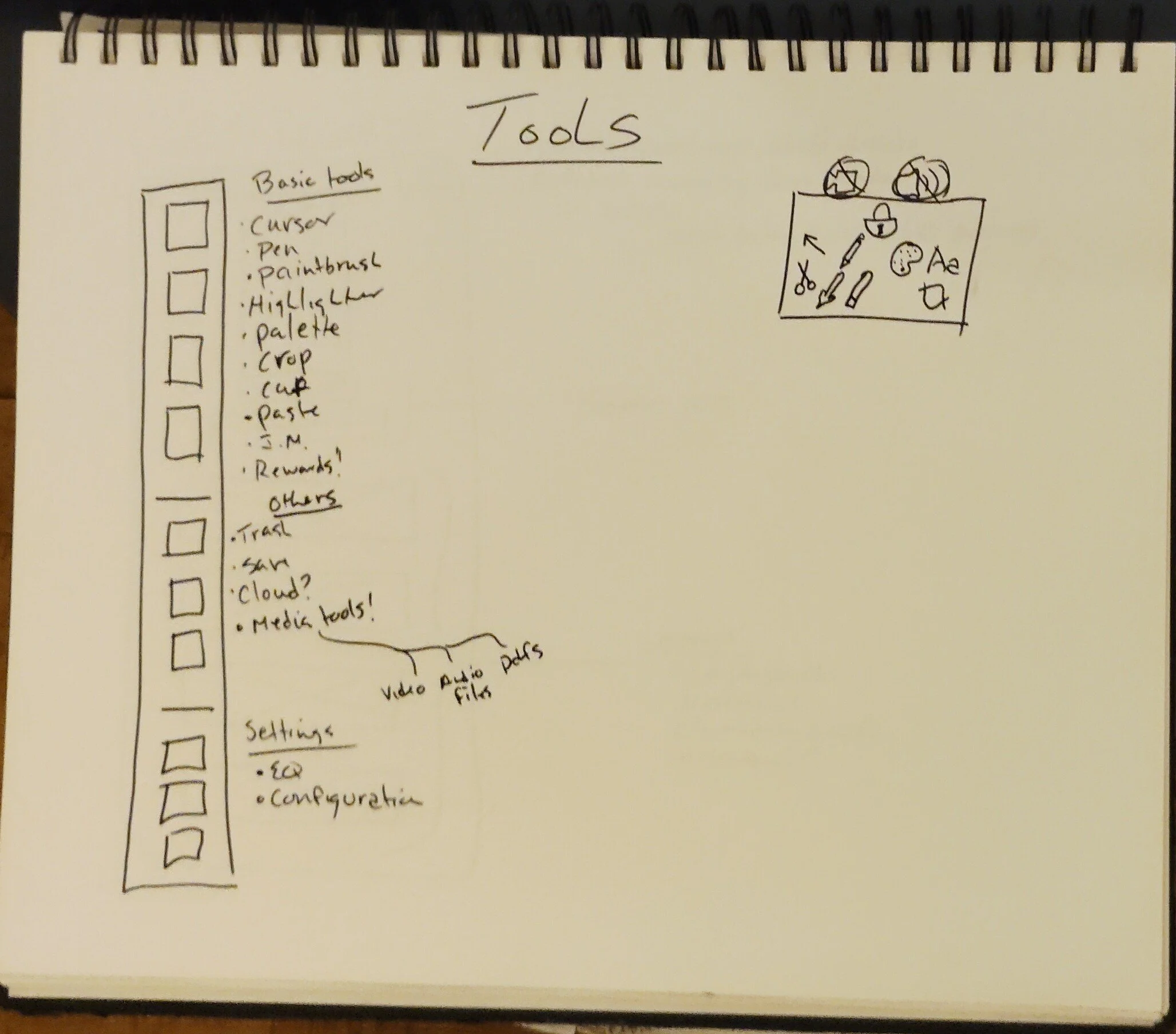
Accessibility was a major goal, so we spent a lot of time thinking about the toolbar and its features. We opted to make it floatable so it could be moved to any part of the screen, thus accommodating right and left-hand users, as well as users who may have needs we were unable to predict.
You will notice the two small boxes on the left-hand side of the screen (right in the wireframe below). We decided to group together several tools to make the toolbar less cramped. The small boxes are pop-outs.
Another major focus was the instructor profile page that would be visible to subscribers. Factoring customer/subscriber concerns about security, we included the ability to watch recordings of previous lessons so any concerns could be reported to the client, but without the ability to personally download them to ensure further security for the instructor.
->

Final Thoughts
and
What I would do Differently
As a research project, this was a great exercise in thinking pan-culturally. As a development project, it suffered from a lot of “reinventing the wheel”.
Developing proprietary software is challenging because every client wants their product to stand out and be unique, but in a market like education there are a lot of standards and expectations. We successfully communicated to the client that some features seem like a great idea in principle, but are rife with issues in practice (eg. ability for subscribers to download lessons).
We also navigated a number of cultural challenges. Chinese clients have very different expectations about data privacy than European clients, as well as expectations about what materials/subjects can be discussed over the platform. We had a lot of great, productive discussions about how to navigate our cultural (and legal) differences. I’m very proud of that. Given the opportunity, I would have liked an even more diverse array of potential subscribers, created more user personas and thought of more use cases, but we ran the risk of overwhelming ourselves.
I wasn’t in love with the chosen colour scheme, but the client requested something “more fun” than a simple dark mode that would put less strain on the eyes than a regular white field. The colours in the prototype were where we landed.